Introduction
Color is the first thing that perceives the eye, even before it manages to distinguish the form or plot. Visual platforms, especially Instagram, are built on an instant impression. Here the color palette is not just a jewelry, but a means of identity, recognition and emotions. A well -built palette in the profile indicates a taste, forms an atmosphere and makes content a single visual stream.
On the blog Gimp Tools Hub We consider the color as one of the most powerful tools of visual narrative. Today we will tell you how to use GIMP to choose a palette, which will not only be stylish, but also organically fit into the character of your Instagram profile. This is not just a selection of shades, but the creation of a visual environment in which each photograph supports and continues the general idea.
Why is a single palette important
When a person opens the profile on Instagram, he sees not one photo, but a net. It is the rhythm, repeatability and color logic that determines how the tape as a whole is perceived. Even the perfect photo may be lost if it is not combined with the rest visually.
One palette:
- forms a holistic style;
- creates a visual association with the author;
- causes aesthetic pleasure;
- Increases involvement due to recognition.
Color becomes a visual voice. And like any speech, it should be consistent.
Where to start: analysis of the visual code
Before choosing a palette, it is important to determine:
- What mood do you want to convey;
- What colors correspond to your subject;
- What style is close to you: minimalism, vintage, natural aesthetics, urbanism.
Analyze your own photos. Is there a dominant color in them? Are warm or cold tones repeated? Are there any saturated accents or everything is built on neutral gamut?
In GIMP, you can easily open several images and compare their side on the side, creating a reference palette on a separate canvas.
Palette selection: basic approaches
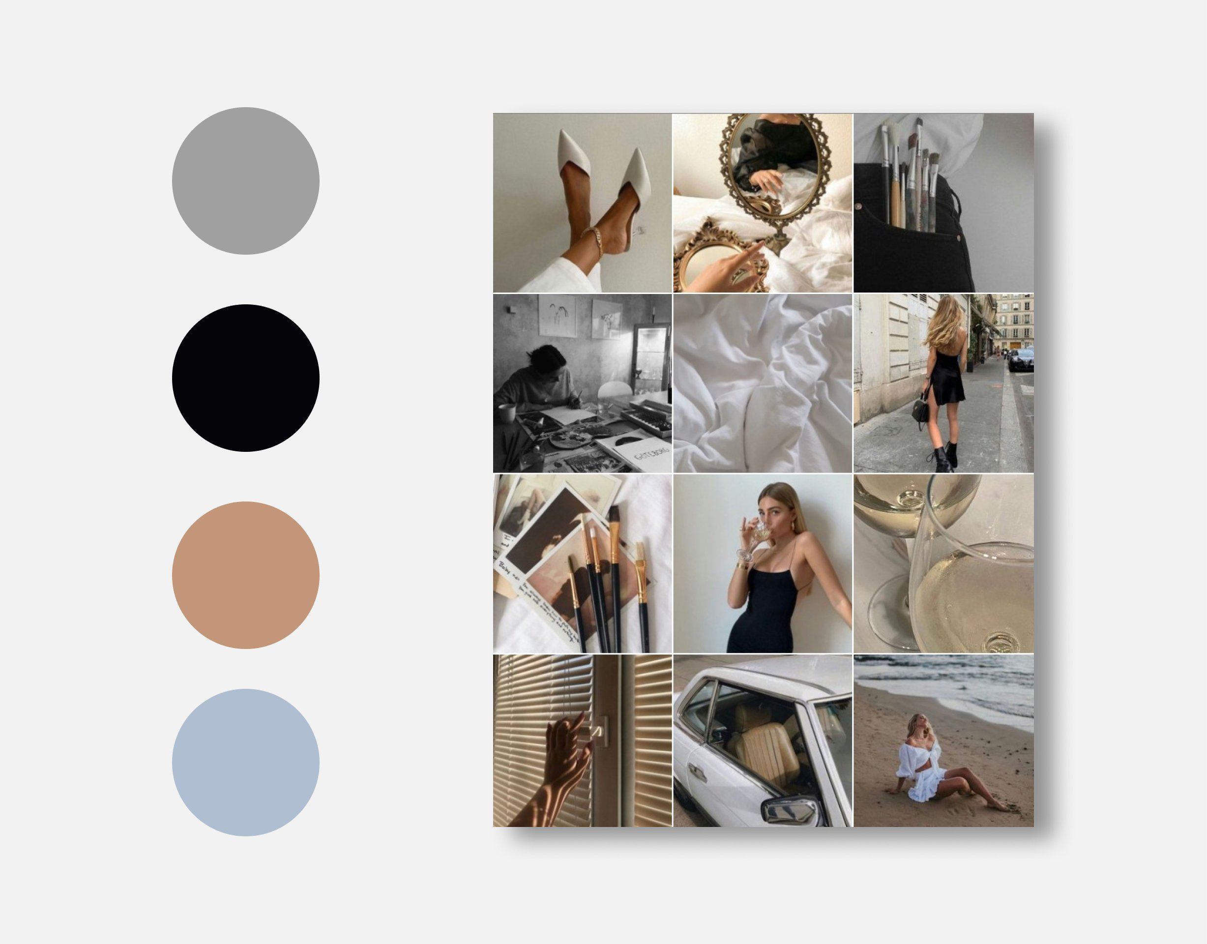
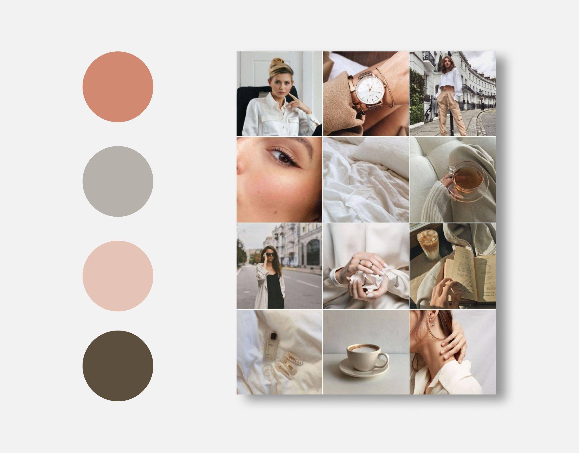
1. Monochrome palette
One color in different shades. A simple but powerful technique. It works well for profiles, where cleanliness and lightness are important: blogs about style, meditation, interior design.
Example: Warm beige in different variations - from almost white to deep coffee.
2. Complete colors
Contrast shades located opposite each other on a color circle. Such a palette is energetic, spectacular and suitable for bright creative profiles.
Example: Blue + warm orange, purple + yellow.
In GIMP you can use the color circle to select such steam, as well as create your own palette through the Sample Points tool and the palette panel.
3. Analog palette
Colors located nearby on a circle. They go well and create a soft, organic atmosphere. This is a frequent choice for natural, travelous and lifstail blogs.
Example: Green + turquoise + blue.
4. Neutral base with accent
The main background of gray, white, sand, and the emphasis is a rich shade: dark blue, terracotta, burgundy. Such a palette easily adapts to different content and retains style.
Practice in GIMP: how to assemble a palette
Step 1. Create a canvas
Open a new document and place several rectangles on it that will represent the colors of the palette.
Step 2. Use the “Pipette” tool
Open your favorite photos or inspiring references. Using a pipette, take 4-6 shades that are repeated or harmonized.
Step 3. Save the palette
Add the selected colors to the GIMP palette for quick access. This will simplify the further processing of the photo - all the necessary shades will be at hand.
Palette application in practice
Color tone and saturation
Correct each photo taking into account the main gamut. You can slightly shift the tone, reduce the saturation of unwanted colors and enhance the necessary ones.
Gradients and tinting
To combine the tape, use light separate tinting: a plain gradient on the shadows and lights will help create the right color sound.
Masks and local correction
Sometimes in one photo the colors that violate the style are combined. In GIMP, you can use masks to adjust individual sections without impact on the entire stage.
Subtleties of perception and context
Color is perceived differently depending on culture, lighting, environment. He also carries an emotional load:
- Cold colors create a distance, tranquility, intelligence.
- Warm - revive, bring closer, add energy.
- Pastel colors make the tape light and airy.
- Dark saturated - give depth and drama.
It is important not just to choose a color, but to feel how much it resonates with your message.
Conclusion
The palette on Instagram is not just a selection of beautiful colors. This is a way to structure visual space, set the mood, build a visual brand. Color makes content recognizable, attractive, honest.
In the GIMP editor, you can not just configure images, but build your visual identity. On the blog Gimp Tools Hub We are sure: the style begins with the color. Find your voice in shades - and your photos will begin to speak with the world without words.
Kelsey Duke
Your post helped me understand this complex topic. Thank you for the clarification!